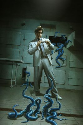
 This assignment was a result in patience. As you well enough know, I do a few conventions a year. On some of those adventures I get to meet the decision makers and show them my work. And with many of all those attempts I go home feeling defeated and unworthy as an artist. However, I plow through that negativity and push forth with new paintings letting them know that I’m not one to dwell and give up. If I remain calm and positive, eventually, those early introductions may blossom into friendships and possible job opportunities. And so here I am. After meeting the Art Director over at Moonstone Books several years ago, they got to see me grow professionally and artistically. I guess it didn’t hurt that a few of my convention pals were also putting in a good word for me since they themselves had done a few pieces with the publisher.
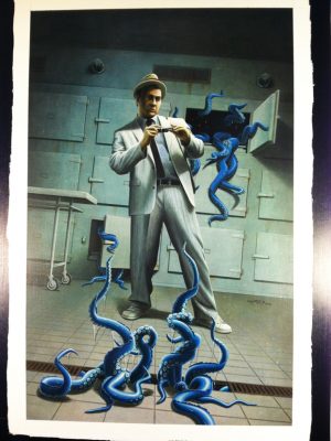
The assignment, a Kolchak: The Night Stalker cover to an anthology of prose stories. Kolchak is now licensed to Moonstone for comics, books, and such. This is exactly what I wanted to do for a while now. I’m glad they finally sought me out.
 |
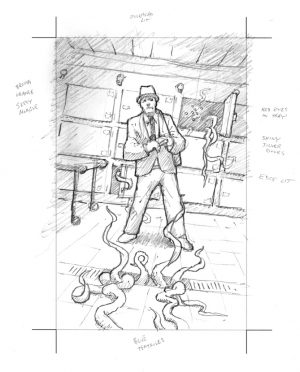 |
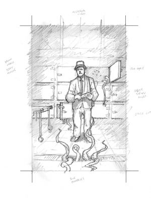
It started with them knowing exactly the direction they wanted. An earlier piece of mine was used as a starting point. “Something like that,” was the general idea. What they wanted was a simple layout, minimal subject matter, but something creepy coming up from the bottom. Easy enough.
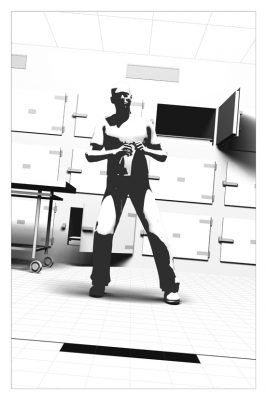
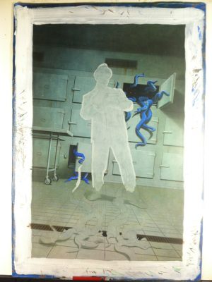
I didn’t do many thumbnails, I knew exactly what I wanted to do. The rotation wasn’t initially planned. However, I needed a way to offset the big gapping hole that the morgue door created. Also, by shifting his stance, I was able to convey his surprise/excitement for the photo opportunity.
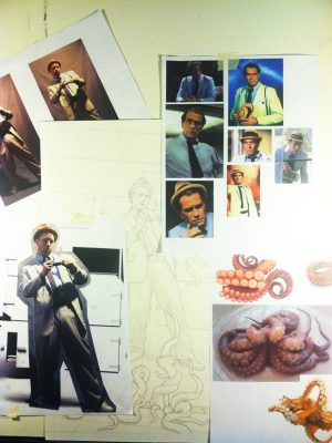
Yeah, that’s me dolled up in the finest Carl Kolchak threads pictured above. I found a Pinstriped Seersucker suit that, sadly, wasn’t the size advertised. I made do. I also grabbed all of the necessary accessories from eBay. Thankfully, I was able to return the suit to help recoup costs.
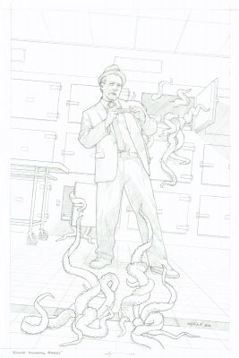
I’m happy with how the piece turned out. It’s very atmospheric! I experimented with the tentacles. They’re not as drippy as I wanted them to look. I need to practice with painting more slime and gooey things.
Final note… I painted this piece too small for the publishers needs. I had to digitally add about an inch and a half to each side. That was fun.
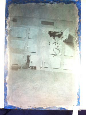
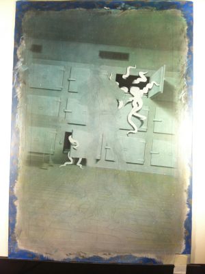
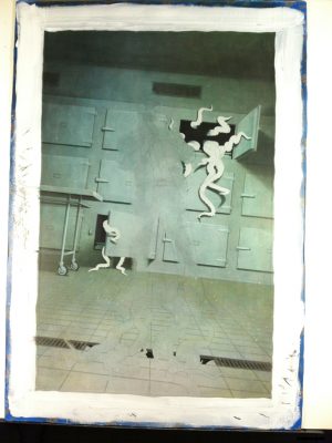
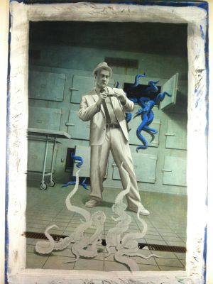
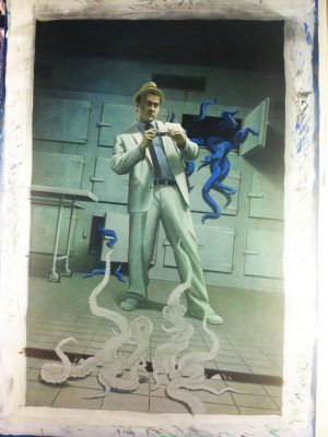
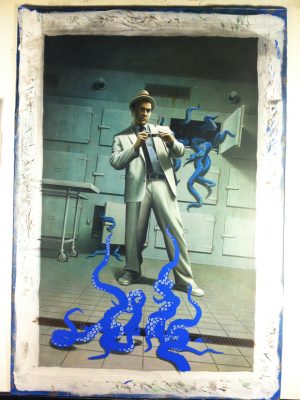
Step-by-Step…
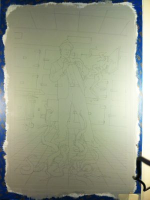 |
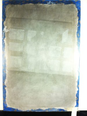 |
 |
 |
 |
 |
 |
 |
 |
 |
I hop you enjoyed this step-by-step reveal. To see close up pics and learn of other information check out this painting in the Gallery HERE.